SONAR Charts uses our client portal's live metrics to display your call data visually through different Card Types. Office managers and call center supervisors can manipulate SONAR Charts so that they include what you want to see of your call center's data in a uniquely customized layout to fit your needs.
ACCESSING SONAR CHARTS
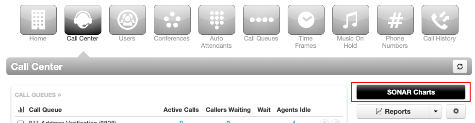
To access SONAR Charts, log in to the Client Portal and navigate to the Call Center tab. On the right side of the page, click SONAR Charts. A new tab will open; from here, you can start creating a new board or click the hamburger menu to access your charts and charts that have been shared with you.
UNDERSTANDING YOUR CARD OPTIONS
SONAR Charts offers a large variety of data options through card types and data filters. First, choose a Card Type you want, whether that be a table, chart, or single statistic. From here, you can distill your data through the advanced filtering tools within the Data subtab, and after you have set filters, alerts, and display preferences under the Style subtab.
SONAR Charts are comprised of various Data Cards that visually represent your call center data.
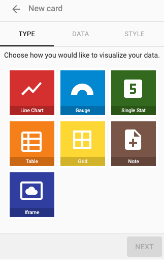
CARD TYPES
There are 7 Card types you can choose from:
- Line Chart - displays a line chart with adjustable metrics.
- Gauge - displays a percentage measurement with a half-circle scale.
- Single Stat - displays a single number or time.
-
Table- three table options:
- Agents (status, average handle time, talk time).
- Call Queues (calls waiting, wait time, agents available, call volume, calls handled).
- Calls Waiting (caller name, caller number, status, wait time).
- Grid - displays agents in a grid prioritized by first name, last name, phone extension, and availability.
- Note - display any text you want to include.
- iFrame - add a nested browsing context, embedding another HTML page into the current one. The URL must either be hosted on the same domain as this application or must support Cross-Origin Resource Sharing.
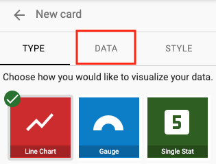
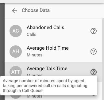
CHOOSING DATA
After you have chosen your Card type, you must select the data you want your card to display. Data options will vary depending on the card type.
ADD DATA FILTERS
Once you have selected the card type and data to watch, you can filter it down to view specific metrics.
Data filters allow you to:
- choose the breakdown (aggregate, per queue, per agent),
- select specific call queue(s),
- set an upper limit for single statistics, and,
- choose the default color.
| NOTE: Not all statistics have all data filter options. |

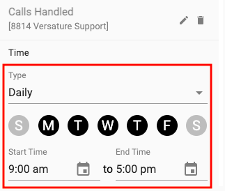
SET YOUR TIME RANGE FILTERS
After you have chosen the statistic, set the breakdown and filtered the queue(s)/user(s), click the Add button in the bottom right for advanced time ranges. Here you can choose between:
- rolling (updates every (x) hours),
- static (a fixed time period), and,
- daily (choose certain days of the weeks with start and end times).

ADD ALERTS
Within the Data sub-tab, you can also choose to add alerts for:
- Line Charts,
- Gauges,
- Single Stats, and,
- Tables.

ORGANIZE YOUR CHART
Once you have created cards for your Chart, you can resize and drag-and-drop so your Chart looks exactly the way you want it to!

